【HarmonyOS Next之旅】基于ArkTS开发(三) -> 兼容JS的类Web开发(四) -> 常见组件(一)
目录
1 -> List
1.1 -> 创建List组件
1.2 -> 添加滚动条
1.3 -> 添加侧边索引栏
1.4 -> 实现列表折叠和展开
1.5 -> 场景示例
2 -> dialog
2.1 -> 创建Dialog组件
2.2 -> 设置弹窗响应
2.3 -> 场景示例
3 -> form
3.1 -> 创建Form组件
3.2 -> 实现表单缩放
3.3 -> 设置Form样式
3.4 -> 添加响应事件
3.5 -> 场景示例

1 -> List
List是用来显示列表的组件,包含一系列相同宽度的列表项,适合连续、多行地呈现同类数据。
1.1 -> 创建List组件
在pages/index目录下的hml文件中创建一个List组件。
/* test.css */
.container {
  width:100%;
  height:100%;
  flex-direction: column;
  align-items: center;
  background-color: #F1F3F5;
}
.listItem{
  height: 20%;
  background-color:#d2e0e0;
  margin-top: 20px;
}
说明
-
是 - 的子组件,实现列表分组功能,不能再嵌套
- ,可以嵌套
。 -
是 - 的子组件,展示列表的具体项。
1.2 -> 添加滚动条
设置scrollbar属性为on即可在屏幕右侧生成滚动条,实现长列表或者屏幕滚动等效果。
/* index.css */
.container {
  flex-direction: column;
  background-color: #F1F3F5;
}
.listItem{
  height: 20%;
  background-color:#d2e0e0;
  margin-top: 20px;
}
.listCss{
  height: 100%;
  scrollbar-color: #8e8b8b;
  scrollbar-width: 50px;
}
1.3 -> 添加侧边索引栏
设置indexer属性为自定义索引时,索引栏会显示在列表右边界处,indexer属性设置为true,默认为字母索引表。
/* index.css */
.container{
  flex-direction: column;
  background-color: #F1F3F5;
 }
.listCss{
  height: 100%;
  flex-direction: column;
  columns: 1
}
说明
-
indexer属性生效需要flex-direction属性配合设置为column,且columns属性设置为1。
-
indexer可以自定义索引表,自定义时"#"必须要存在。
1.4 -> 实现列表折叠和展开
为List组件添加groupcollapse和groupexpand事件实现列表的折叠和展开。
          One---{

  {listgroup.value}}


          Primary---{

  {listgroup.value}}
/* index.css */
.doc-page {
  flex-direction: column;
  background-color: #F1F3F5;
}
list-item{
margin-top:30px;
}
.top-list-item {
  width:100%;
  background-color:#D4F2E7;
}
.item-group-child {
  justify-content: center;
  align-items: center;
  width:100%;
}
// test.js
import prompt from '@system.prompt';
export default {
data: {
direction: 'column',
list: []
},
onInit() {
this.list = []
this.listAdd = []
for (var i = 1; i <= 2; i++) {
var dataItem = {
value: 'GROUP' + i,
};
this.list.push(dataItem);
}
},
collapse(e) {
prompt.showToast({
message: 'Close ' + e.groupid
})
},
expand(e) {
prompt.showToast({
message: 'Open ' + e.groupid
})
}
}
说明
- groupcollapse和groupexpand事件仅支持list-item-group组件使用。
1.5 -> 场景示例
在本场景中,可以根据字母索引表查找对应联系人。
      Contacts


          {

  {$item.name}}
          18888888888


        Total: 10
/* index.css */
.doc-page {
  width: 100%;
  height: 100%;
  flex-direction: column;
  background-color: #F1F3F5;
}
.list {
  width: 100%;
  height: 90%;
  flex-grow: 1;
}
.item {
  height: 120px;
  padding-left: 10%;
  border-top: 1px solid #dcdcdc;
}
.name {
  color: #000000;
  font-size: 39px;
}
.number {
  color: black;
  font-size: 25px;
}
.container {
  flex-direction: row;
  align-items: center;
}
.in-container {
  flex-direction: column;
  justify-content: space-around;
}
// test.js
export default {
data: {
namelist:[{
name: 'Zoey',
section:'Z'
},{
name: 'Quin',
section:'Q'
},{
name:'Sam',
section:'S'
},{
name:'Leo',
section:'L'
},{
name:'Zach',
section:'Z'
},{
name:'Wade',
section:'W'
},{
name:'Zoe',
section:'Z'
},{
name:'Warren',
section:'W'
},{
name:'Kyle',
section:'K'
},{
name:'Zaneta',
section:'Z'
}]
},
onInit() {
}
}
2 -> dialog
Dialog组件用于创建自定义弹窗,通常用来展示用户当前需要或用户必须关注的信息或操作。
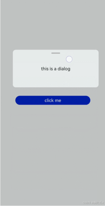
2.1 -> 创建Dialog组件
在pages/index目录下的hml文件中创建一个Dialog组件,并添加Button组件来触发Dialog。Dialog组件仅支持width、height、margin、margin-[left|top|right|bottom]、margin-[start|end]样式。
/* test.css */
.doc-page {
  width:100%;
  height:100%;
  flex-direction: column;
  align-items: center;
  justify-content: center;
  background-color: #F1F3F5;
}
.dialogClass{
  width: 80%;
  height: 250px;
  margin-start: 1%;
}
.content{
  width: 100%;
  height: 250px;
  justify-content: center;
  background-color: #e8ebec;
  border-radius: 20px;
}
text{
  width: 100%;
  height: 100%;
  text-align: center;
}
button{
  width: 70%;
  height: 60px;
}
/* test.js */
export default {
//Touch to open the dialog box.
openDialog(){
this.$element('dialogId').show()
},
}
2.2 -> 设置弹窗响应
点击页面上非Dialog的区域时,将触发cancel事件而关闭弹窗。同时也可以通过对Dialog添加show和close方法来显示和关闭弹窗。
/* test.css */
.doc-page {
  width:100%;
  height:100%;
  flex-direction: column;
  align-items: center;
  justify-content: center;
  background-color: #F1F3F5;
}
.dialogClass{
  width: 80%;
  height: 300px;
  margin-start: 1%;
}
.dialogDiv{
  width: 100%;
  flex-direction: column;
  justify-content: center;
  align-self: center;
}
text{
  height: 100px;
  align-self: center;
}
button{
  align-self: center;
  margin-top: 20px;
  width: 60%;
  height: 80px;
}
/* test.js */
import prompt from '@system.prompt';
export default {
canceldialog(e){
prompt.showToast({
message: 'dialogCancel'
})
},
openDialog(){
this.$element('dialogId').show()
prompt.showToast({
message: 'dialogShow'
})
},
confirmClick(e) {
this.$element('dialogId').close()
prompt.showToast({
message: 'dialogClose'
})
},
}
说明
-
仅支持单个子组件。
-
Dialog属性、样式均不支持动态更新。
-
Dialog组件不支持focusable、click-effect属性。
2.3 -> 场景示例
在本场景中,可以通过Dialog组件实现一个日程表。弹窗在打开状态下,利用Textarea组件输入当前日程,点击确认按钮后获取当前时间并保存输入文本。最后以列表形式将各日程进行展示。
{
{date}} events
{
{date}} event
{
{$item.schedule}}
/* test.css */
.doc-page {
  flex-direction: column;
  background-color: #F1F3F5;
}
.btndiv {
  width: 100%;
  height: 200px;
  flex-direction: column;
  align-items: center;
  justify-content: center;
}
.btn {
  radius:60px;
  font-size: 100px;
  background-color: #1E90FF;
}
.schedulediv {
  width: 100%;
  height: 200px;
  flex-direction: column;
  justify-content: space-around;
  padding-left: 55px;
}
.text1 {
  color: #000000;
  font-weight: bold;
  font-size: 39px;
}
.text2 {
  color: #a9a9a9;
  font-size: 30px;
}
.dialogdiv {
  flex-direction: column;
  align-items: center;
}
.innertxt {
  width: 320px;
  height: 160px;
  flex-direction: column;
  align-items: center;
  justify-content: space-around;
}
.text3 {
  font-family: serif;
  color: #1E90FF;
  font-size: 38px;
}
.text4 {
  color: #a9a9a9;
  font-size: 33px;
}
.area {
  width: 320px;
  border-bottom: 1px solid #1E90FF;
}
.innerbtn {
  width: 320px;
  height: 120px;
  justify-content: space-around;
}
.btntxt {
  text-color: #1E90FF;
}
/* test.js */
var info = null;
import prompt from '@system.prompt';
import router from '@system.router';
export default {
data: {
curYear:'',
curMonth:'',
curDay:'',
date:'',
schedule:'',
schedulelist:[]
},
onInit() {
// Obtain the current date.
var date = new Date();
this.curYear = date.getFullYear();
this.curMonth = date.getMonth() + 1;
this.curDay = date.getDate();
this.date = this.curYear + '-' + this.curMonth + '-' + this.curDay;
this.schedulelist = []
},
addschedule(e) {
this.$element('datedialog').show()
},
canceldialog(e) {
prompt.showToast({
message: 'Event setting canceled.'
})
},
getschedule(e) {
info = e.value
},
cancelschedule(e) {
this.$element('datedialog').close()
prompt.showToast({
message: 'Event setting canceled.'
})
},
// Touch OK to save the data.
setschedule(e) {
if (e.text === '') {
this.schedule = info
} else {
this.schedule = info
var addItem = {schedule: this.schedule,}
this.schedulelist.push(addItem)
}
this.$element('datedialog').close()
}
}
3 -> form
Form是一个表单容器,支持容器内Input组件内容的提交和重置。
说明
从API Version 6开始支持。
3.1 -> 创建Form组件
在pages/index目录下的hml文件中创建一个Form组件。
/* test.css */
.container {
  width:100%;
  height:100%;
  flex-direction: column;
  justify-content: center;
  align-items: center;
  background-color: #F1F3F5;
}
3.2 -> 实现表单缩放
为Form组件添加click-effect属性,实现点击表单后的缩放效果。
3.3 -> 设置Form样式
通过为Form添加background-color和border属性,来设置表单的背景颜色和边框。
/* test.css */
.container {
  width: 100%;
  height: 100%;
  flex-direction: column;
  align-items: center;
  justify-content: center;
  background-color: #F1F3F5;
}
.formClass{
  width: 80%;
  height: 100px;
  padding: 10px;
  border: 1px solid #cccccc;
}
3.4 -> 添加响应事件
为Form组件添加submit和reset事件,来提交表单内容或重置表单选项。
/* index.css */
.container{
  width: 100%;
  height: 100%;
  flex-direction: column;
  justify-items: center;
  align-items: center;
  background-color: #F1F3F5;
}
.form{
  width: 100%;
  height: 30%;
  margin-top: 40%;
  flex-direction: column;
  justify-items: center;
  align-items: center;
}
/* test.js */
import prompt from '@system.prompt';
export default{
onSubmit(result) {
prompt.showToast({
message: result.value.radioGroup
})
},
onReset() {
prompt.showToast({
message: 'Reset All'
})
}
}
3.5 -> 场景示例
在本场景中,可以选择相应选项并提交或重置数据。
创建Input组件,分别设置type属性为checkbox(多选框)和radio(单选框),再使用Form组件的onsubmit和onreset事件实现表单数据的提交与重置。
/* index.css */
.container {
  width: 100%;
  height: 100%;
  flex-direction:column;
  align-items:center;
  background-color:#F1F3F5;
}
.txt {
  font-size:33px;
  font-weight:bold;
  color:darkgray;
}
label{
  font-size: 20px;
}
/* test.js */
import prompt from '@system.prompt';
export default {
formSubmit() {
prompt.showToast({
message: 'Submitted.'
})
},
formReset() {
prompt.showToast({
message: 'Reset.'
})
}
}
感谢各位大佬支持!!!
互三啦!!!
